In the dynamic world of technical writing, conveying complex information effectively often requires more than well-chosen words. It demands various diagram types to enhance content and engage customers. Ideally, this is where a dedicated graphics design team would be a great help with their expertise and creativity. However, many of us work for small businesses or companies with limited resources and do not have the luxury to fall back on such a team. This is where we can step up and enhance our own visibility and value within the organization.
To do so, we might have to acquire new skills. This might be daunting, especially when we lack confidence in our design abilities or are unsure where to start or what tools to use. But this is also an opportunity for personal growth and development, and a chance to expand our skill sets.
A harmonious color palette
If your company does not already have a color palette, the first step is to create one that ensures alignment with the company’s brand identity. Which colors should be selected, and how should they be chosen to ensure harmony?
First, identify the colors of your logo. These will be your leading colors. With the help of an online color wheel tool (such as Adobe Color Wheel or Coolors.co), you can generate a harmonious color palette for your diagrams. A color wheel tool supports you in your journey to create visual standards for your team. When creating a color palette for your diagrams, you can use this simple formula:
Select two primary colors, two secondary colors, and two accent colors. With this straightforward formula, you can confidently create a harmonious color palette for your diagrams.
What is a color wheel?
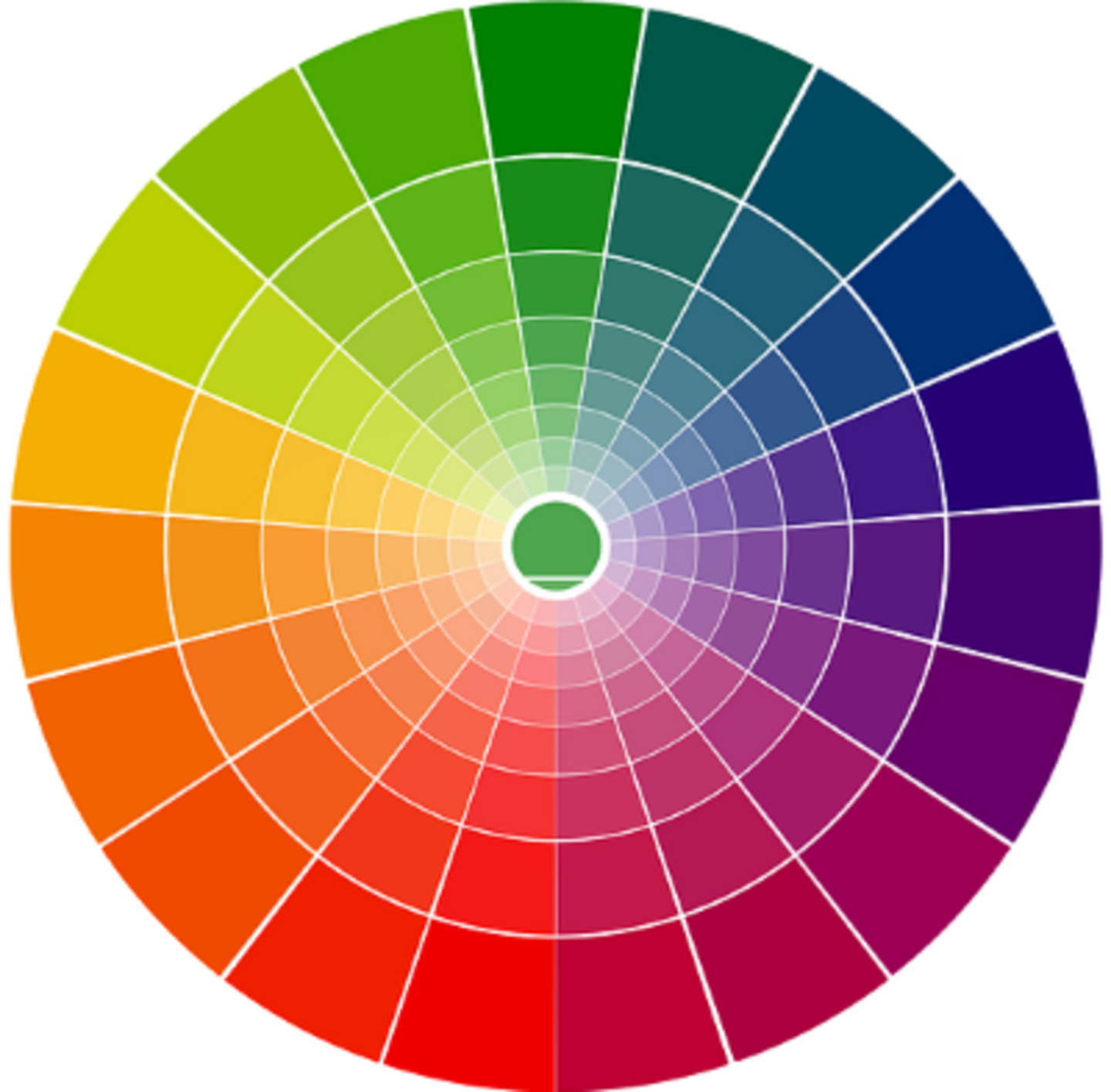
Figure 1: The color wheel
Sir Isaac Newton first described the color wheel in 1666. It shows various colors, including primary, secondary, and tertiary colors.
Primary colors are red, blue, and yellow. These cannot be made by mixing other colors.
Secondary colors are formed by mixing two primary colors. These are purple (mixing red and blue), orange (mixing red and yellow), and green (mixing blue and yellow).
Tertiary colors are a mix of primary and secondary colors. For example, amber is created when red and orange are mixed.
Selecting colors
Colors are powerful communication tools. They are essential in conveying information and influencing people to make decisions. Studies have revealed how different colors affect our human behavior and emotions. How colors influence individuals may differ depending on age, gender, and culture. A 2022 study of more than 4000 people from 30 different countries provides insight into what we associate with certain colors. It showed that 68% of participants related red with love, the same number of people associated yellow with joy, and 35% associated blue with relief. Green evokes satisfaction and happiness in 39% of participants, and 25% linked purple with pleasure.
With each color having a different meaning, check how the colors in your palette reflect your brand and impact your audience. Let’s look at some examples of color associations:
Red is often linked with love and passion, but also with opposing aspects such as danger and anger.
Blue promotes loyalty and authority. In business, blue is mostly found in social media, tech companies, banking, insurance, airlines, auto manufacturers, and pharmaceuticals.
Yellow is linked with joy and positive energy. Regarding business, it implies the idea of affordability or even warmth. This color is also a good option for companies targeting younger customers or those operating in the food industry.
Purple reflects luxury, ambition, mystery, and magic. It is also considered stylish and associated with generosity and power. Regarding business, purple promotes products for women and children, healthcare, and finance.
Orangepromotes energy, success, and happiness. It is the color of activeness, kindness, and accessibility. It also represents creativity and adventure. Orange might be a good option for businesses that target children or young people.
Green is often associated with nature and the environment. It symbolizes purity, balance, sustainability, organics, health, and well-being. Green suits organizations such as hospitals, pharmacies, pharmaceutical companies, or anything related to a healthy lifestyle.
Other visual considerations
Having created the color palette, let’s take a look at the elements each diagram consists of. These are text and labels, shapes, connectors and arrows, icons, and legends for complex diagrams.
Text and labels
Select a sans-serif font for the text and labels within your diagrams. Ensure that the font is available from the sans-serif family so it does not break when a customer views your diagrams in SVG file format, for example. Such fonts are Arial, Verdana, Tahoma, and so on. If you work on Mac, the font type is Helvetica. Use this font for the text in all your diagrams to maintain consistency.
Consider using labels for the following diagram components:
- Titles: For any diagram,give a title that tells the story of this diagram and what it depicts.
- Legends: Ensure you properly label all elements within a diagram that might otherwise confuse or mislead your audience.
- Icons: Maintain consistency in the placement of icons. Depending on the space and complexity of diagrams, labels can be placed to the left or right of, or above or below, the component icon.
- Definition: Use definitions for any non-obvious name or acronym.
Always use regular text. Do not use underlining, bold, or italics, as this formatting can overwhelm the reader. Use an online contrast checker tool to ensure that the colors you generate and the text color you select are accessible. The contrast ratio must be at least 4.5:1 to meet accessibility requirements. An example of an accessibility check can be seen in Figure 2.
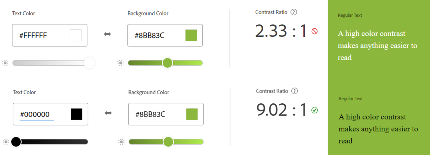
Figure 2: Exampleof an accessibility check
Shapes
Different shapes convey different meanings. For example, you will need an oval shape or terminator to depict the start or end of a process, a rectangular shape for a process or step, and a diamond shape for decisions.
Make sure to use different colors for each different shape, and apply this style to all your diagrams. You might need additional shapes depending on your industry and the kind of systems you are describing. Do not use effects on your shapes such as shadows, gradient colors, or 3D effects. Also, placing one colored layer over another is inappropriate for people with color deficiency.
You can use either filled shapes or outlined or dotted shapes. Filled shapes must not have borders, and outlined or dotted shapes must use the same weight and dash type. Dotted shapes are usually used to describe an optional process or step. You can also use solid or dashed borders to group elements within a diagram that are part of the same component (see Figures 3 and 4).
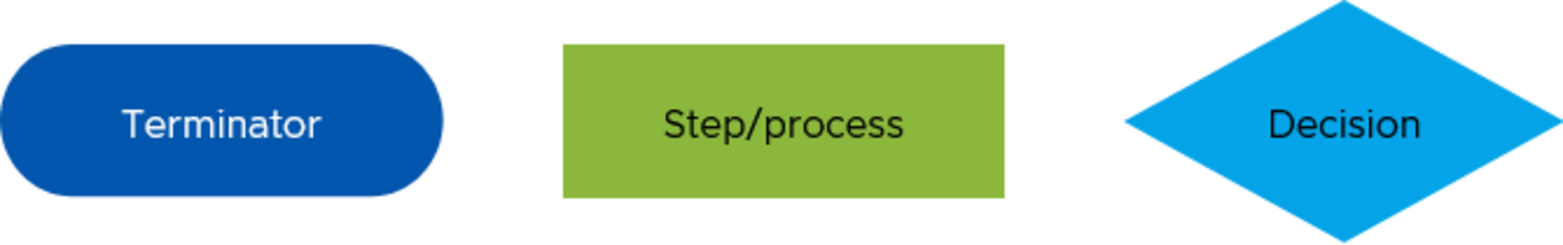
Figure 3: Examples of basic shapes with a flat color
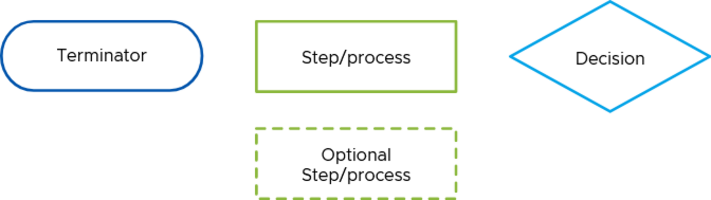
Figure 4: Example of outlined shapes
Connectors and arrows
We use connectors and arrows to connect different elements. They indicate the direction or flow of the process. To maintain consistency, determine the connector’s weight, color, and arrow type, and use this style across all your diagrams. Avoid crossing lines, diagonal lines, or curved lines. Figure 5 shows examples.

Figure 5: Examples of connectors and arrows
Icons
Icons within a diagram can be helpful to improve readability and reduce clutter. We use icons to represent components and simplify a concept without using words. Create your own icons library to easily reuse and customize icons for your diagrams in size, color, and orientation. There are some helpful free online resources that you can use to download the icons you need. For example, you can download icons from Material Symbols of Google, Clarity Design, and so on.
Legends
Create a legend for any complex diagram that explains any significant colors, line types, arrows, and so on to avoid confusion and misinterpretation.
Design principles in a nutshell
When you create a diagram, make sure that you adhere to the following design principles. Ensure that diagrams comply with the following principles:
They should
- be straightforward and easy to understand.
- follow the average reading direction – from left to right and top to bottom.
- use simple shapes and as few different shapes as possible.
- have a clear starting point.
- have no crossed, diagonal, or curved lines.
- not rely on color alone to convey meaning.
- be correctly aligned to avoid a chaotic appearance.
- stick to the color palette, using no more than three or four colors in one diagram (if possible).
- use red only for error messages.
- be saved as SVG or PNG files to ensure the quality of the images you implement in your documentation.
After determining the visual style for every element of your diagram, you can quickly establish a visual standard for your team and create a visual template for diagrams.
Creating a template
A visual standard template for diagrams defines company branding elements such as the color palette, font type, font size, and color. The template should encompass diagram elements, like the shapes typically used, connectors, and arrows with specified weights, colors, and arrow types.
It is beneficial to have an icon database of frequently used icons, such as product icons and elements from your product’s user interface, and reusable diagram templates that include placeholders for various elements like shapes, connectors, and labels, see Figure 6.

Figure 6: Example of a simple diagram within a visual standard template
Having a visual standard template for diagrams is essential for several reasons.
Consistency and clarity
A standard template ensures that all diagrams follow the same format, making it much easier for your audience to understand and interpret information. Clarity is crucial, particularly where documentation consists of complex diagrams.
Efficiency and quality
A visual standard template saves time creating diagrams, allowing you to focus on the content and accuracy of the information rather than on design aspects. This will increase the quality of the diagrams.
Maintenance
When updates are needed, such as changing the color palette for your organization or the logo sign, you can easily apply the necessary changes and update your diagrams.
Reviews and feedback
Using a predefined design style template for every component to create diagrams makes it easy for other team members and subject-matter experts to review and provide feedback.
Training and onboarding
Standard templates make creating training materials easier, ensuring everyone is aligned with the established standard. New team members can also quickly start using the visual standard.
In conclusion
Establishing a visual standard for your diagrams is essential for ensuring consistency, enhancing clarity, and boosting efficiency. This will save time and make your content look more professional. As technical writers, it is essential to continuously improve our skill sets to elevate the quality of documentation, contribute to the efficiency and effectiveness of the writers' team, and take advantage of opportunities for professional development.